


The Space Between: Exploring UX Patterns for Touchless Screen Interactions
As we continue to adjust to changes in our daily routines brought on by COVID, we have accelerated our acceptance and adoption of new technology at an exponential rate.
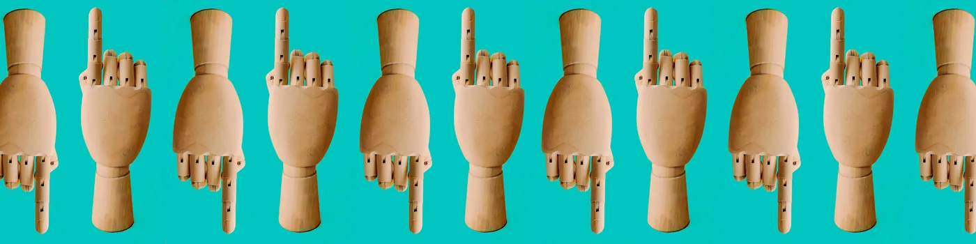
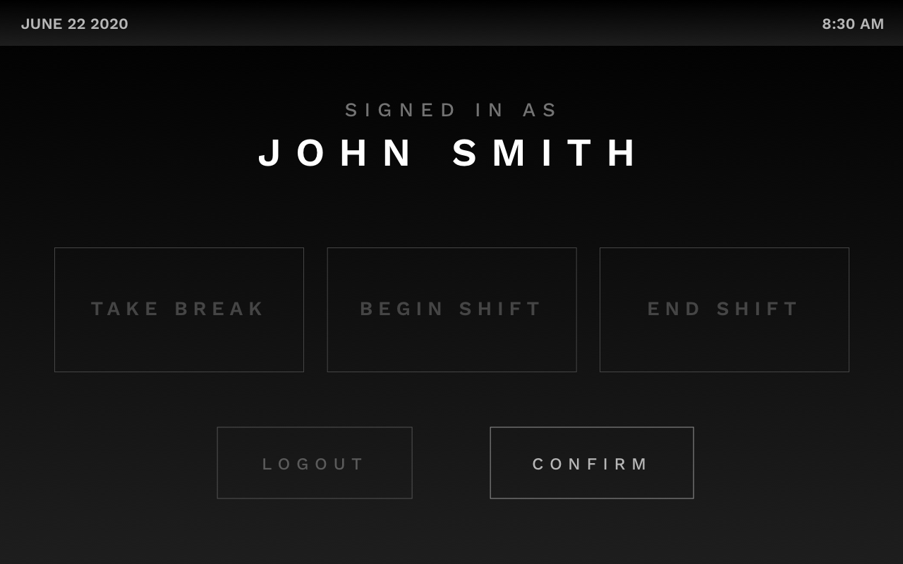
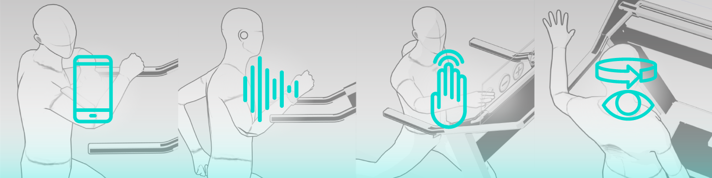
We finally settled on a classic piece of tech, the punch clock, to conduct our test. A punch clock needs to remain in a fixed position and requires that many people use it throughout the day. We wanted to dig into how moments of interaction need to be specifically designed for users in the context of how they will be using them. With a punch clock, the user wants a quick and efficient experience so that they can move into the actual work they need to do. This helped us focus our efforts on making the UX of our touchless screen as simple and flat as possible. The biggest challenge we encountered was data entry. How do you “tap” when you are not physically tapping a screen? We explored many possible solutions but ultimately landed on 4 unique approaches:
- Hover Tap
- Path Lock
- The Click Flick
- Floating Stylus
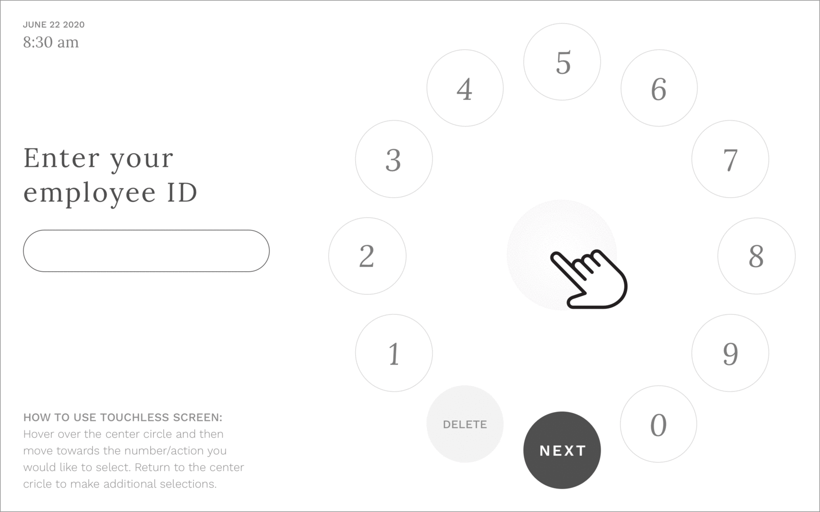
Hover Tap
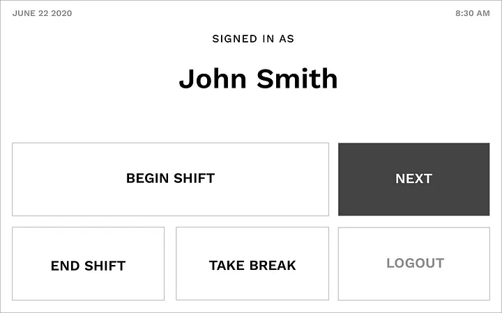
This approach remains very similar to the current touchscreen user experience, except the normal tap is replaced by a time-based hover. This hover is extremely short, so the interaction is the right balance between still being efficient, but being long enough for the device to detect the difference between making a selection and moving across the device.
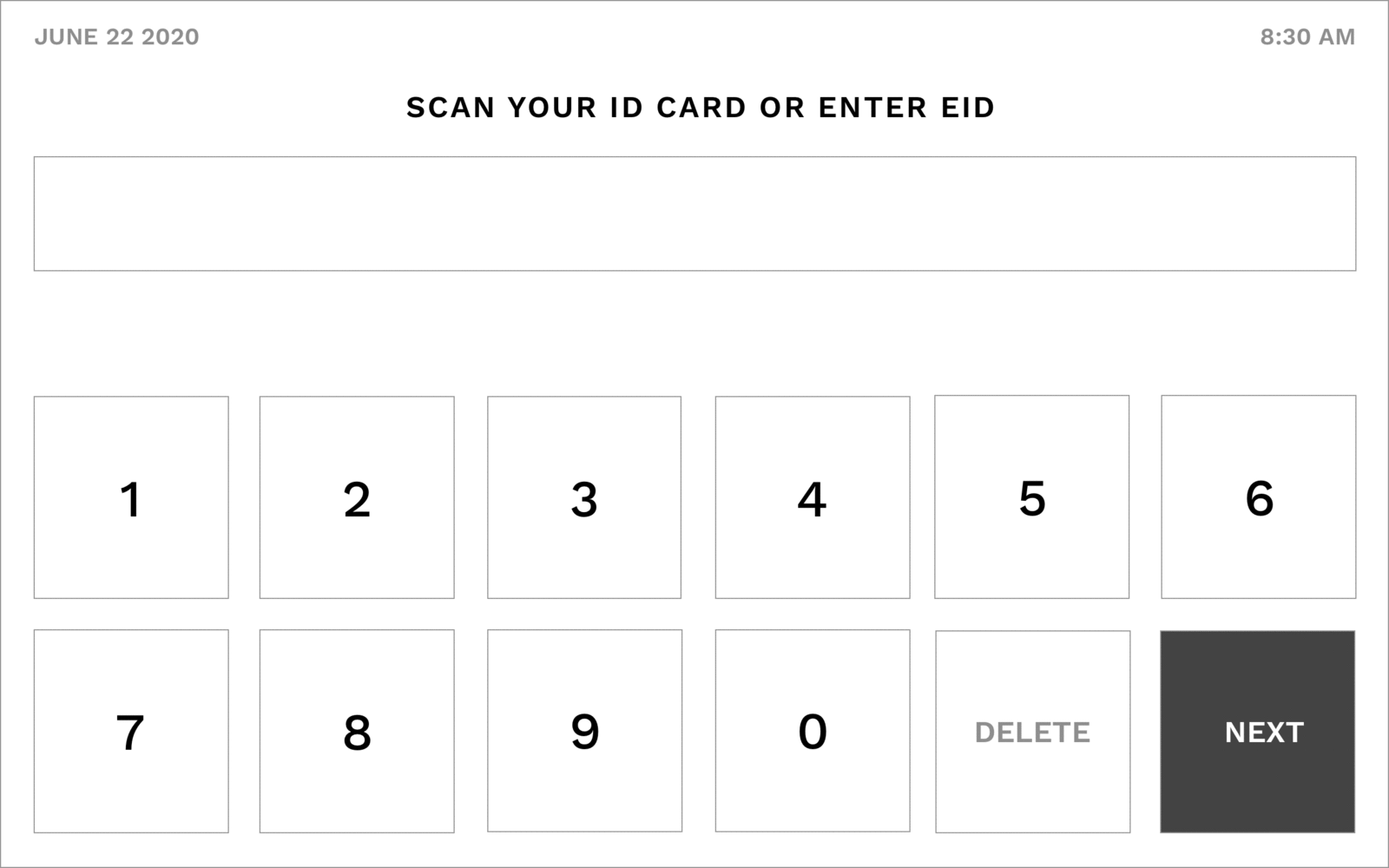
Once the user pauses over their selection, the indicator will appear to begin the selection process. In this example, a thick thicker outline would begin to appear around the selection. The process of the outline building would be quick, less than one second. Once the outline is finished building, the button will change color to indicate that is has been selected
This works for single selection options…
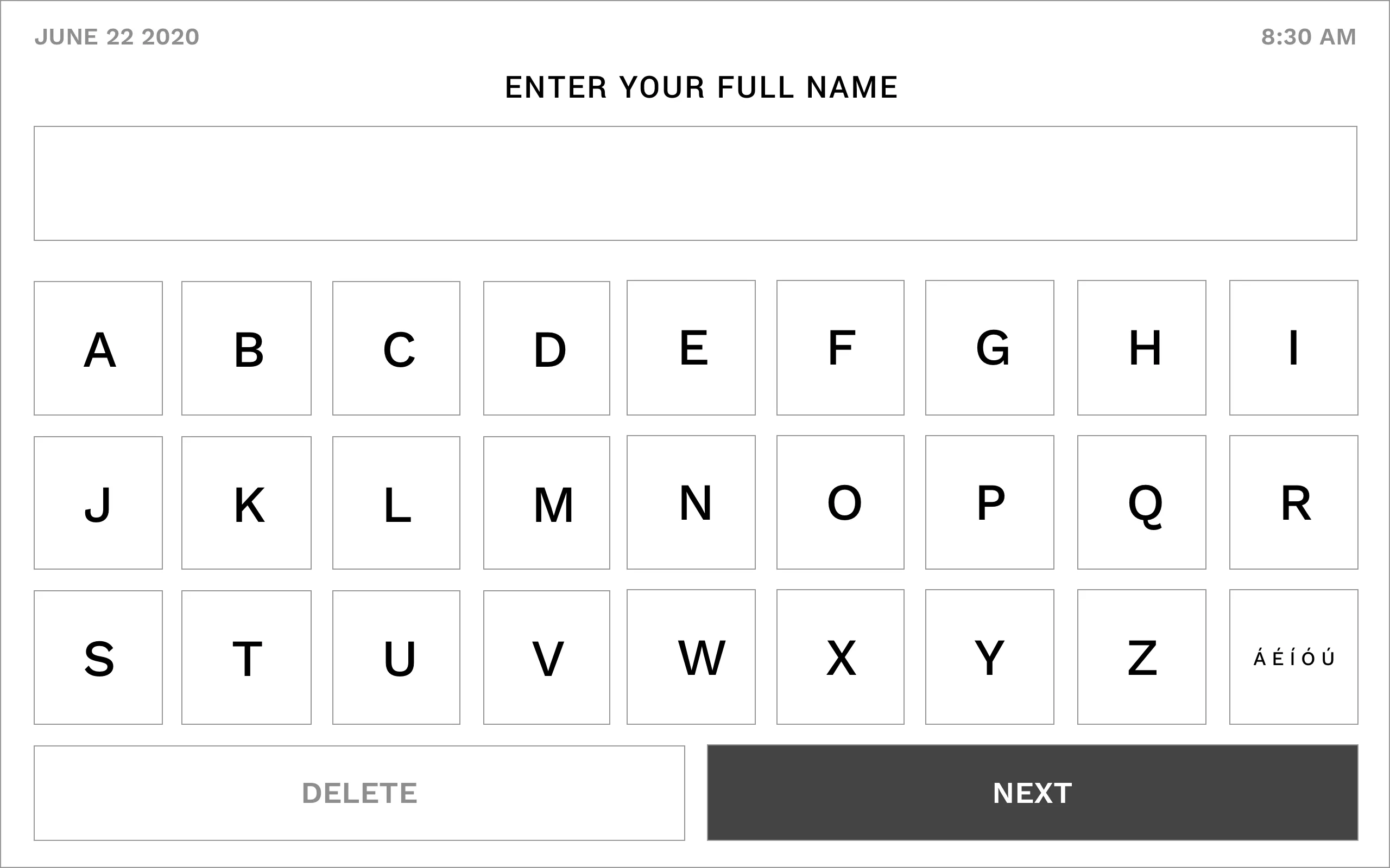
…as well as written options
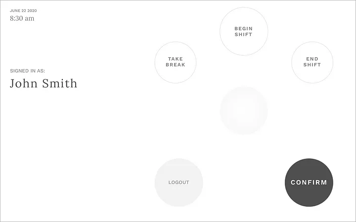
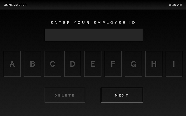
Path Lock
Without the limitations and constraints of physically touching the screen, there is an opportunity to explore new UX treatments. For this option, the selection keys are placed in a manner that allows for the user’s movements to signal their intent. With this arrangement, the device is able to determine what the user is going to select before they have moved all the way to the selection.
The user would start at the center of the “dial” and then move toward their selection. As they move closer to their desired selection the device would intuitively make the selection before they reached it and then the user would go back to the center to make their next selection.
With fewer options, they are spread apart further for easy selection
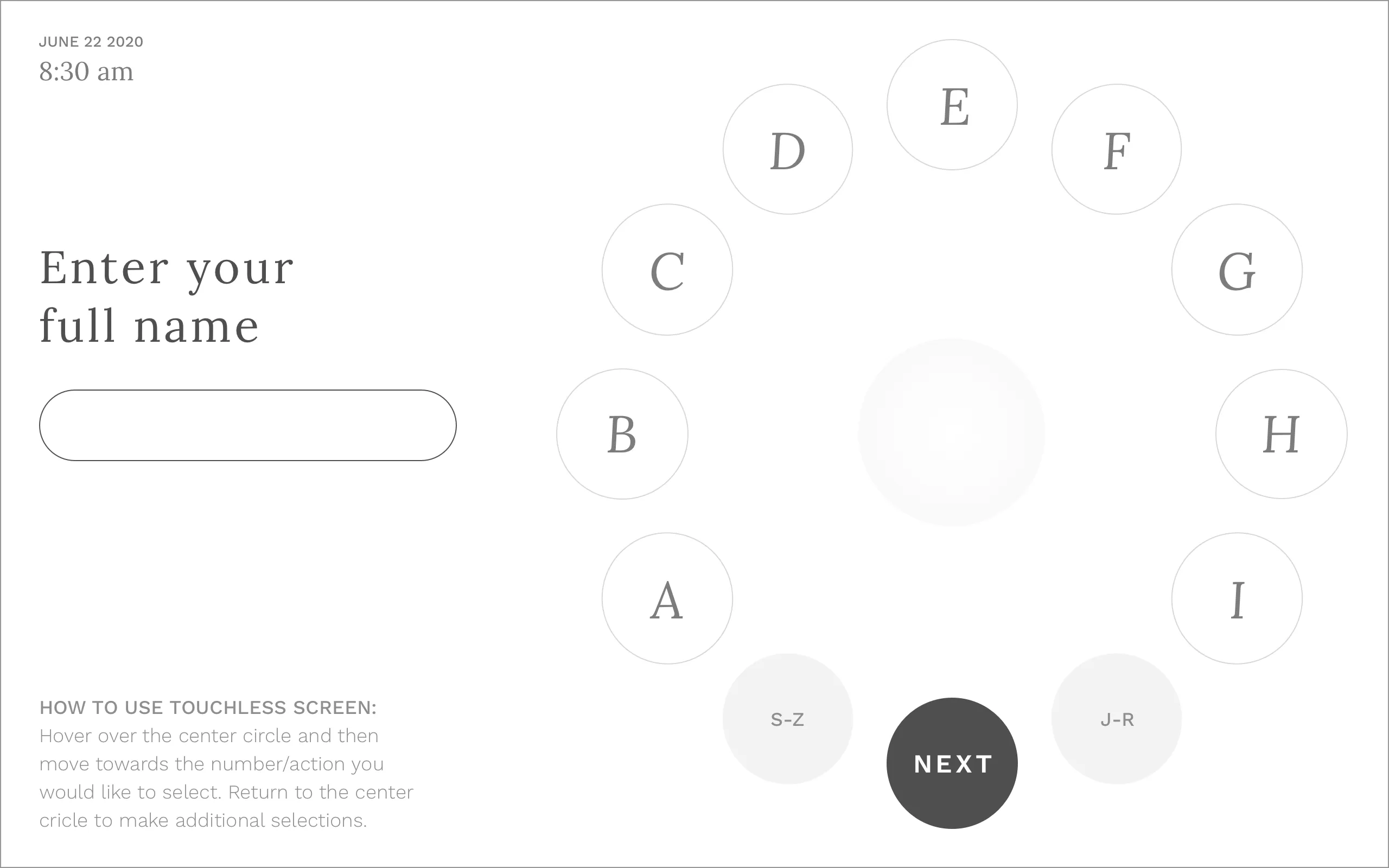
To keep the screen simple and make selections obvious, the alphabet is split into 3 sections
Click Flick
The way a user moves can also control their selection, allowing us to explore a solution that is more gesture-based. In this interface, moving horizontally allows users to scroll through their options, with a distinct quick up or down “flick” enabling the user to make their desired selection.
Once the user moves over a selection it will highlight and animate the direction to flick to make their selection — in this case, up. The selection will also animate in the same direction to reinforce the selection movement. Once the user moves off the selected option, their selection will be made.
When there are fewer options to select from, the target area for each selection will be made larger
In cases where there are more selection options than fit in the viewable area (like the alphabet), the selections will slowly auto-scroll when users are on the far left or right of the device. (Hovering of “A” or “B” will scroll left while hover over “H” or “I” will scroll right.)
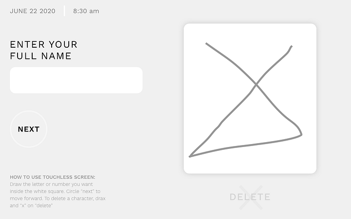
Floating Stylus
For this final option, we wanted to see how far we could push touchless technology. We explored a smart AI that could recognize hand-drawn characters and translate them into something that the punch clock system could understand.
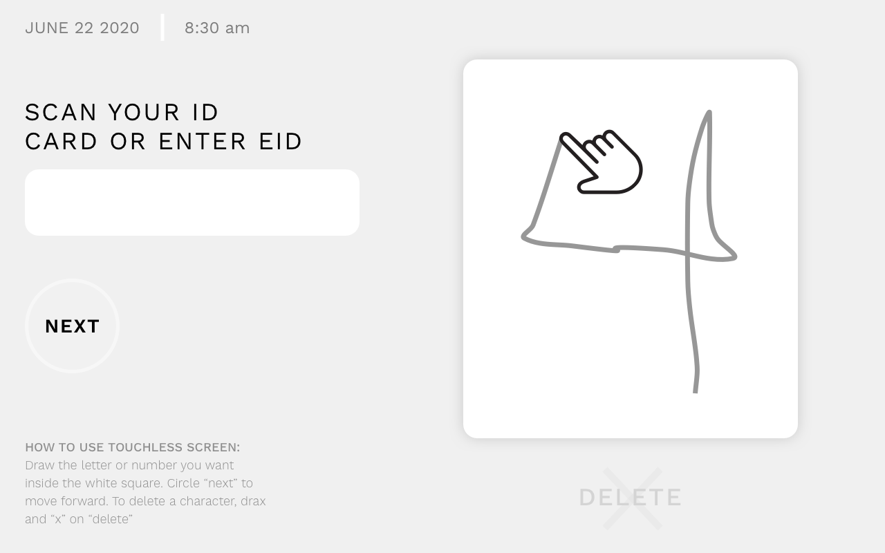
The user can freely write in the white rectangle area. Their writing will not go into the gray area.
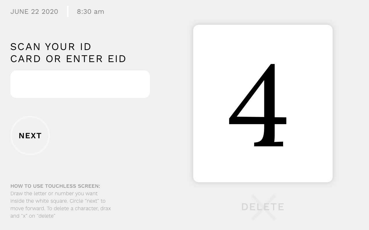
Once they have finished the device will translate their writing.
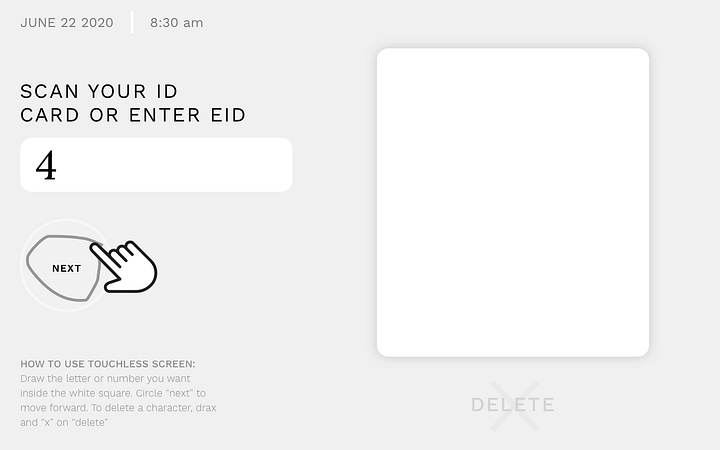
To complete their entry, the user circles the “next” button.
If there are multiple options to select from, the user simply has to mark in the appropriate box to make their selection.
Letters would function the same as numbers…
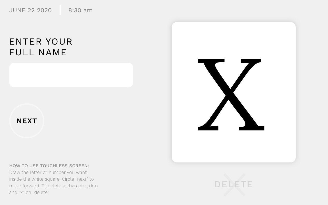
…and be converted after the user has completed creating the letter.
Context is Key
Creating new and innovative tech is exciting but for it to truly be an effective, thoughtful experience is key to adoption and consistent use. If you are looking for ways of making your product more user-friendly while adapting to the challenges of a post-COVID world, let’s talk.
Related Articles
-
Hands Off: Choosing the Right Touchless Tech in the Era of COVID
February 22, 2023 · 12 mins readAs life (hopefully) begins to return to normal in the coming months, there is no doubt that COVID-19 will have lasting effects on the... -
The Space Between: Exploring UX Patterns for Touchless Screen Interactions
February 15, 2023 · 22 mins readAs we continue to adjust to changes in our daily routines brought on by COVID, we have accelerated our acceptance and adoption of new... -
Brand Values You Can Hold: An Introduction to Visual Design Languages.
February 13, 2023 · 13 mins readInevitably there comes a point in the product development process where a deceptively simple question must be answered